A chart is a graphical representation of data that can help us understand the data in a better way. It is an essential tool used in many fields like business, science, education, and more. Charts help us visualize data in a clear and concise manner, making it easier to interpret the information. There are several types of charts available for use, including line charts and pie charts. While both are commonly used, they serve different purposes and have different benefits.
The line chart, also called a line graph, is the most basic type of chart. It is a method of displaying information as a series of data points connected by straight lines. Line charts are typically used to show how a variable changes over time, which makes them well-suited for trending data. For example, a line chart could be used to show the stock price of a company over time or the temperature of a city over a month.
One of the biggest advantages of line charts is that they are straightforward to read and interpret. The depiction of data points is clear and easy to understand, as they are connected by a straight line. Line charts also convey trends well. The upward or downward slope of a line provides a quick and visual representation of how the variable changes over time.
Another benefit of line charts is their simplicity. While more complex charts like scatter plots and bubble charts require multiple data sets, line charts have only one data set, making them easy to understand and create. Additionally, line charts allow the analysis of multiple data sets at once by representing them with multiple lines on the same chart. This feature makes it easy to compare and contrast various trends.
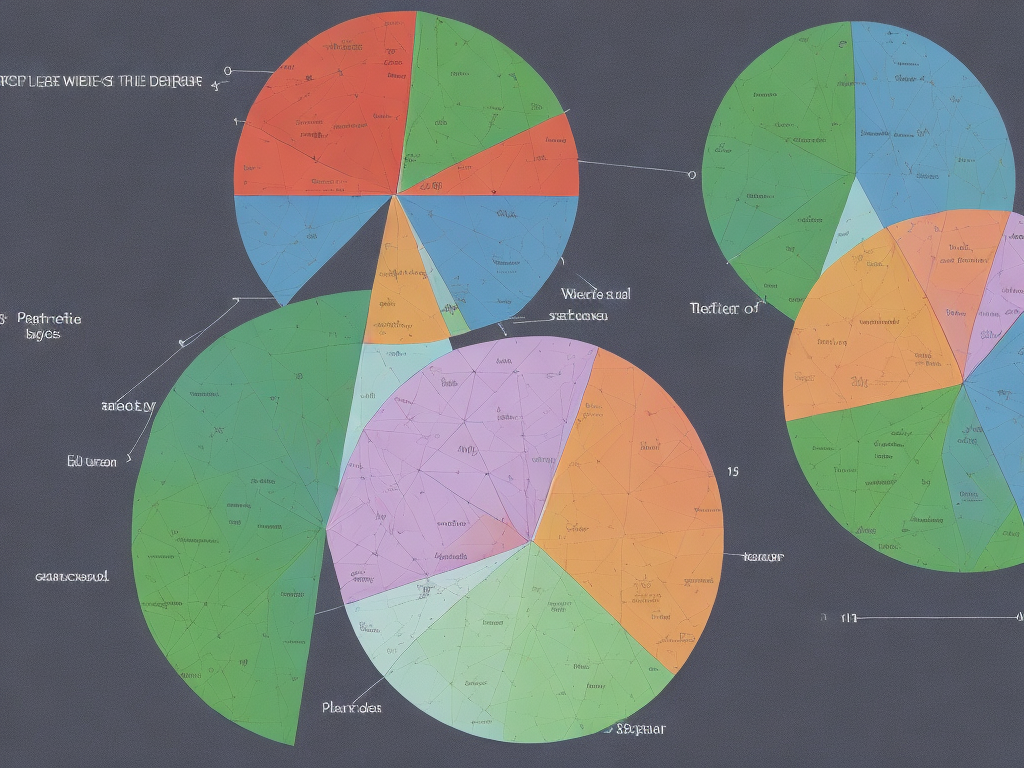
Pie charts, on the other hand, represent data as a whole. In other words, they display the portions that make up a whole dataset. Pie charts show these portions in a circular shape and divide the whole into slices. These slices represent different categories or segments of data. The size of each slice is proportional to the value it represents in comparison to the whole. Pie charts are thus useful when we wish to display categorical data as percentages.
One of the benefits of pie charts is their visually appealing appearance. The colors and shapes of the slices can attract attention to the data more vividly as compared to even the most attractive line chart. As the pie chart represents the whole, it quickly shows how the data is distributed across various categories, making it easy to compare different categories with each other. Additionally, pie charts are easy to understand, even for individuals without a background in data analysis. This makes this chart type popular in a wide range of domains for communicating complex statistical information visually.
Pie charts provide an essential method to show a snapshot of the data. However, as the number of categories increases, the chart can become challenging to read. This is because the slices become smaller and more difficult to compare, leading to confusion for the viewer.
Another disadvantage of pie charts is their inherent limitation to depict trends over time. Line charts excel in portraying the data over time, and it is difficult to represent that with a pie chart. The pie chart is undoubtedly useful in comparing different categories based on their sizes, whereas the line chart excels in displaying trends and changes over time.
Which chart should you choose – a pie chart or a line graph – actually depends on the type of data you are working with, and what you would like the reader to understand from it. Pie charts are best used to display data that shows how much different categories contribute to the whole. On the other hand, line graphs are favored when illustrating the trends and changes over time in a variable.
In conclusion, both line charts and pie charts are incredibly useful tools, and their uses differ greatly from one another.
While line charts provide an easy way to look at how a variable is changing over time, they cannot be used to display parts of a whole likes pie charts do. On the other hand, pie charts are excellent in displaying parts of a whole and make it easy to compare the sizes of the different portions. Ultimately, the choice depends on the type of data you are displaying and what you want the viewer to understand from it.